7 Event Staffing Dashboard Metrics to Track
August 31, 2026

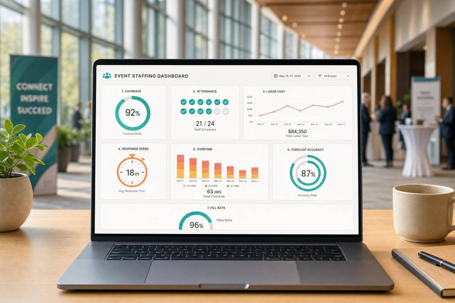
If I had to track only seven staffing numbers for events, I’d track these: fill rate, shift acceptance rate, no-show rate, labor cost per event, overtime, response time to shift invites, and projected vs. actual hours.
Why these seven? Because they answer the big questions fast:
That matters because labor can make up 44% of total hospitality costs, and last-minute replacement staff can cost 2–3x normal rates. On top of that, overtime often runs at 1.5x pay. So if I miss early warning signs, margin can slip fast.
Here’s the short version:
These metrics work best when I read them together, not one by one. For example, high acceptance + high no-shows points to common scheduling problems with attendance. Low fill rate + slow response time points to a timing problem with invites. And full coverage + high labor cost often means the event ran longer than planned.
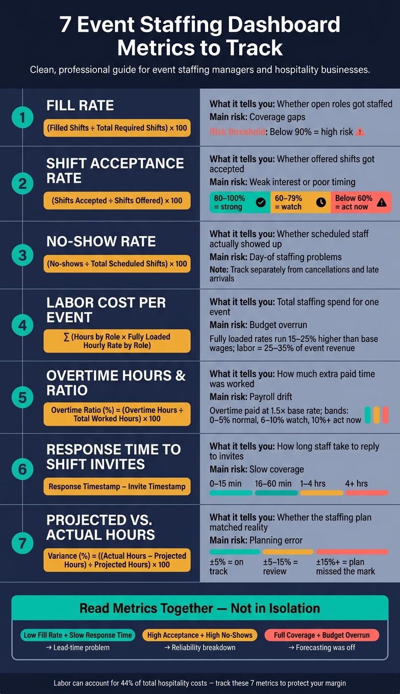
7 Event Staffing Dashboard Metrics: What to Track & Why
| Metric | What it tells me | Main risk if it’s off |
|---|---|---|
| Fill Rate | Whether open roles got staffed | Coverage gaps |
| Shift Acceptance Rate | Whether offered shifts got accepted | Weak interest or poor timing |
| No-Show Rate | Whether scheduled staff showed up | Day-of staffing problems |
| Labor Cost per Event | Total staffing spend for one event | Budget overrun |
| Overtime Hours / Ratio | How much extra paid time was worked | Payroll drift |
| Response Time | How long staff take to reply | Slow coverage |
| Projected vs. Actual Hours | Whether your staffing plan matched reality | Planning error |
In this article, I’d focus on these seven numbers because they give a simple view of coverage, attendance, cost, and planning accuracy without loading the dashboard with extra clutter.
Dashboard metrics turn past staffing results into rules you can use for the next event. They show you what keeps happening, where the weak spots are, and what to change before those problems hit again.
For example, if your fill rate keeps landing below 90% for large events, that’s a plain sign you need to invite more staff at the start or build a backup pool. If weekend or holiday shifts get slow responses, that points to a timing issue. In that case, sending invitations earlier in the week gives you a better shot at locking people in.
The money side gets painful fast when you miss these signals. Day-of replacement workers can cost 2–3× standard rates when no-shows aren’t expected. Unplanned overtime runs at 1.5× the base hourly rate for every overtime hour. That’s why a metric matters only when it helps you pinpoint which events, roles, or venues are creating the risk.
The bigger payoff comes from segmentation. Looking at one blended average across all jobs can hide the stuff that hurts you most. A weekday corporate lunch and a Saturday festival don’t behave the same way. Their no-show patterns, acceptance rates, and overtime risk can be completely different. If you treat them as one big group, you end up with staffing rules that fit some events but fall apart on the ones with the most pressure.
The same metric can tell very different stories depending on how you break it down:
| Metric | By Role | By Venue | By Event Type | By Date |
|---|---|---|---|---|
| Fill Rate | Spot talent gaps in specific positions | Identify locations staff avoid | See which formats are hardest to staff | Track seasonal capacity dips |
| No-Show Rate | Flag unreliable staff categories | Detect access or parking issues | Assess whether event type affects attendance | Identify high-risk holiday shifts |
| Response Time | Find which roles take longest to confirm | See if distance reduces interest | Gauge staff enthusiasm by format | Plan lead time for peak seasons |
| Labor Cost | Compare cost across different specialists | Track travel-related cost creep | Budget weddings vs. corporate events | Manage overtime during busy weeks |
That’s exactly why the seven metrics below are worth tracking on their own.
Fill rate is the share of needed shifts or roles that were staffed for a given event or time period.
A simple formula looks like this:
Fill Rate (%) = (Filled Shifts ÷ Total Required Shifts) × 100
If fill rate slips, every other staffing metric gets tougher to manage. It’s the core coverage metric for the rest of the dashboard.
The percentage by itself doesn’t tell the whole story. A 90% fill rate means one thing when you need 10 people and something very different when you need 200. That’s why your dashboard should show the percentage next to filled, required, and open shifts.
Fill rate tells you whether staffing is keeping up with demand. When the number is high, recruiting, scheduling tools, and outreach are doing their job. When it drops, you’re looking at a coverage gap.
This metric is most useful when you use it to fix a specific problem. Break it out by role and timing to see what’s going wrong. Is the issue late posting? Or perhaps you need a more scalable event scheduling system to handle volume. Or are some roles just harder to staff? You can also split it by role, venue, and event type so it’s clear where to add staff, post earlier, or set tighter coverage targets.
A trend chart works well here, especially when you pair it with a breakdown table. The chart shows whether fill rate is moving up or down week over week or from one event to the next.
| Dashboard View | What It Shows |
|---|---|
| Headline widget | Current fill rate (%) with filled vs. open shift counts |
| Trend chart | Fill rate over time, week over week or by event |
| Breakdown table | Fill rate by event, role, and venue with unfilled shifts flagged below target |
Once you know whether shifts got filled, the next thing to watch is how fast people say yes.
Shift acceptance rate measures the percentage of offered shifts that staff accept within a defined time window.
Formula: Shift Acceptance Rate (%) = (Shifts Accepted ÷ Shifts Offered) × 100
Fill rate tells you if you got coverage. Acceptance rate tells you how hard it was to get there. That difference matters. If acceptance is low, it's often an early warning that staffing problems are on the way. High rates often point to strong staff engagement and shift details that are easy to understand. Low rates usually signal pay that isn't competitive, poor timing, or role expectations that aren't clear.
This metric helps you make practical calls fast. If acceptance is slipping, you may need to post shifts earlier, increase pay, or open the offer to a larger pool.
It also helps to break acceptance rate down by role, event type, and pay rate. That makes it easier to spot which shift offers need better pricing or clearer details. Send invitations early, and include the basics up front:
Complete shift details cut down on back-and-forth and help staff confirm faster.
| Dashboard View | What It Shows |
|---|---|
| Summary KPI card | Overall acceptance rate (%) for the selected period, vs. prior period |
| Breakdown table | Acceptance rate by event, role, and pay rate, with events flagged below the target threshold |
| Trend line chart | Acceptance rate over time |
If acceptance looks strong but coverage still comes up short, the next metric to watch is no-show rate.
Acceptance tells you who agreed to work. No-show rate tells you who actually showed up.
No-show rate measures how often scheduled staff miss a shift they were assigned to. The formula is simple: No-show rate = (No-shows ÷ total scheduled shifts) × 100. Use the same time frame in every report so the numbers stay comparable.
This metric helps you spot where attendance issues are hurting coverage. When the rate is high, the problem is often tied to process gaps: unclear shift expectations, weak reminder systems, poor role matching, long travel distances, or workers booking too many shifts.
Use this number to tighten confirmation steps, pull backup staff from a waitlist, and give critical roles to workers with strong attendance records. If no-show rate starts climbing, that's a sign to confirm closer to the event date or put your most dependable workers on high-stakes shifts. That's why this metric works well after fill rate. On paper, coverage may look fine. On event day, it can still fall apart.
Don't lump no-shows together with cancellations or late arrivals. A cancellation happens before the shift starts. A late arrival means the worker still comes, just not on time. If you mix those together, you end up with one messy number that hides what’s going wrong. Track each one on its own in your dashboard.
| Dashboard View | What It Shows |
|---|---|
| KPI tile | Current no-show rate (%) vs. prior period, plus raw count |
| Event-level table | Scheduled staff, no-shows, and no-show rate per event - filter by role and location |
| Trend line chart | No-show rate over time, with a 90-day rolling average for baseline comparison |
High acceptance plus high no-shows points to last-minute dropouts, not weak interest.
Once you’ve got coverage handled, the next thing to watch is cost. That’s what tells you if the staffing plan still makes sense.
Labor cost per event means the full staffing cost for a single booking. That includes wages, payroll taxes, benefits, workers’ compensation, and overtime premiums.
Formula: Total Event Labor Cost = Σ (Hours by Role × Fully Loaded Hourly Rate by Role)
Track regular hours and overtime hours separately so the dashboard shows the full labor cost clearly.
Use fully loaded rates, not just base wages. Looking at wages alone can make labor seem cheaper than it is by 15–25% once payroll taxes, benefits, and workers’ compensation are added in. For example, a server paid $20/hour may actually cost $26–$28/hour on a fully loaded basis.
This metric says more than total payroll because it shows why costs are moving. You can see if an overrun came from too many people on the schedule, too much overtime, or a role mix that leaned too heavily on higher-cost staff. It also gives you a clean way to compare events of different sizes and see which booking types cost more to staff. In full-service catering, labor often lands at 25–35% of event revenue.
That makes this metric useful for pricing, staffing, and overtime decisions. When labor cost runs high, the cause is often low fill rates, overtime, or more staff than the event needed.
Use the dashboard to compare planned cost vs. actual cost for each event.
| Dashboard View | What to Include |
|---|---|
| Event-level table | Planned labor budget, actual labor cost, variance, and overtime portion per event |
| Role-based breakdown | Cost split by servers, bartenders, kitchen, coordinators |
| Labor % of revenue | Actual labor cost as a percentage of event revenue, with threshold indicators |
| Trend line | Labor cost per event over time to spot upward drift across similar bookings |
Add a variance column - planned vs. actual - so over-budget events stand out right away, without anyone having to dig through the numbers by hand.
If labor cost starts climbing, check overtime hours and overtime ratio next. That’s often where the extra spend shows up first.
When actual labor cost comes in above plan, overtime is usually the first place to check. If labor cost is climbing, overtime often shows exactly where the schedule slipped.
Overtime hours are the total hours worked beyond the planned shift, based on your overtime policy. The overtime ratio turns that raw total into a percentage, which makes it much easier to compare small events and large ones on the same scale.
Formulas:
Under federal law, overtime is paid at at least 1.5× the regular rate for covered, non-exempt employees.
A rising overtime ratio usually points to a deeper scheduling problem. In plain terms, your planned hours no longer match what the event actually takes. That gap often comes from underestimating setup and teardown time, weak forecasting, repeat last-minute changes, or leaning too hard on the same core team instead of spreading hours across a larger staff pool.
That matters for more than payroll. Tired crews tend to move slower, and mistakes become more likely. The ratio can also show whether your base schedule is too thin for a certain event type or venue.
| Dashboard View | What to Include |
|---|---|
| Event-level table | Event name, date, venue, total worked hours, overtime hours, overtime ratio (%), and overtime cost |
| Role breakdown | Overtime hours split by role |
| Trend chart | Overtime ratio over time |
| Conditional formatting | Use red/yellow/green bands based on your internal thresholds |
If one event type keeps running high on overtime, that’s a clear sign your base staffing template needs work. You may need to add positions, shorten planned shift lengths, or bring in a scheduled relief crew instead of stretching the same people longer and longer.
Use overtime data to adjust base staffing, trim shift length, or add relief coverage before the next booking.
If overtime is rising, check whether slow shift responses are forcing late coverage.
If overtime is going up, slow replies to shift invites may be part of the issue.
Response time to shift invitations tracks how long staff take to reply to a shift invite, usually in minutes or hours. Be clear about what you mean here: are you measuring the first reply or the acceptance time? That distinction matters. Fast replies help lock in coverage before the event day starts slipping into scramble mode.
Response Time = Response Timestamp − Invite Timestamp
Use the average or median across all invites. It helps to show the median next to the average, because one very late reply can pull the average up and give you a warped picture.
This metric shows how fast open shifts move from invite to reply. When response times drag, the cause is often pretty plain: too many invites, outreach sent at the wrong time, event info that isn't clear, or shift details that take too long to review and accept.
You can use this data to fine-tune:
For example, if weekday catering shifts get replies in 12 minutes but weekend late-night events take 2 hours, send alerts earlier, open the invite to more workers, or send reminders sooner.
Track response time per invitation, not per worker, especially when the same shift is sent out more than once.
| Dashboard View | What to Include |
|---|---|
| Trend line chart | Average or median response time over time |
| Segmented table | Response time by event type, role, day of week, and time of send |
| Per-invitation table | Invite sent time, first response time, status, and assignment outcome |
| Threshold flag | Highlight invites with no reply by your cutoff, so you can escalate coverage fast |
Set your benchmark based on your actual fill window, not some made-up target. If response time is still too slow, compare projected hours with actual hours to check whether the schedule itself is off.
Projected hours vs. actual worked hours tells you how closely your event plan matched the time your team actually spent on the job. When projections are off, staffing levels slip, overtime stacks up, and labor budgets start to drift. Using tools for last-minute catering staff scheduling can help you maintain control when plans shift.
Two formulas handle the core math:
A positive number means you went over plan. A negative number means you came in under.
Say you planned 200 hours for a wedding, but the team worked 220. That puts you at +10% variance. Those extra 20 hours don’t just sit on a report. They show up in labor cost and can push people into overtime.
A good rule of thumb is simple: keep this metric within ±5% when things are on track. ±5% to ±15% is worth a closer look. Anything past ±15% usually means the original staffing plan missed the mark. Overages often happen when breakdown takes longer than expected, service style needs more hands, or the client makes late changes. Underruns usually suggest overstaffing or padding the schedule too much.
Don’t just track this as one big average. Break it out by event category and venue. That’s where the useful patterns tend to show up. Outdoor festivals, for example, can run 15–20% over plan because load-in takes longer and crowd control adds more work than expected. Once you spot that kind of pattern, you can set better buffers for future events that look similar.
Use a dashboard that makes the gaps easy to see:
| Dashboard View | What to Include |
|---|---|
| Side-by-side bar chart | Projected vs. actual hours per event so gaps are easy to spot |
| Variance table | Event name, date (mm/dd/yyyy), event type, venue, projected hours, actual hours, hour variance, and variance (%) with color-coding to flag within-target, moderate, and high-variance events |
| Trend line | Average variance (%) by month or quarter to see whether planning is getting better |
| Role-level drilldown | Variance split by role (servers, bartenders, captains) to show where the mismatch is piling up |
Read this metric alongside overtime and labor cost. That helps you tell the difference between a planning issue and a staffing issue.
Read the dashboard in order: open shifts → response speed → acceptance rate → fill rate → no-shows → overtime and labor cost → projected vs. actual hours.
That order matters. If you treat each metric like its own score, it's easy to miss what's driving the problem. But when you read them as a chain, you can spot the cause before it turns into a coverage gap or a cost issue.
The table below shows common metric pairs and what they signal.
| What the dashboard shows | Likely interpretation |
|---|---|
| Low fill rate + slow response time | Shift invitations went out too late; lead-time problem |
| High fill rate + high no-show rate | Coverage looked good on paper, but reliability broke down |
| High no-show rate + rising overtime | Remaining staff are absorbing missed shifts at premium pay |
| Full coverage + budget overrun | Actual hours exceeded projected hours; forecasting was off |
| High acceptance + poor coverage | Staff confirmed but didn't show; confirmation workflow needs work |
Use these pairings to separate coverage issues from planning issues.
A no-show doesn't stay isolated. It can ripple through the rest of the dashboard, driving overtime, replacement labor, and manager time. That's why attendance and cost need to be read side by side.
The same goes for staffing problems versus forecasting problems. Strong fill and acceptance rates paired with bad hour variance usually point to poor scoping. Accurate hour forecasts with weak response and no-show rates point to execution problems. Once you know which group of metrics is falling short, you know where to step in first.
Keep it simple: one clear view per metric. That way, managers can scan for risk fast instead of hunting through clutter. It also helps to read the dashboard in the same order as the staffing workflow: coverage, response, acceptance, attendance, then cost.
Start with a fill-rate risk table. Include staffing needed, staffed count, fill rate, and risk level for each event or shift block. Mark events at 100%+ as low risk, 90%–99% as moderate, and anything below 90% as high risk. You can tune those cutoffs based on how sensitive the event is to understaffing.
For shift acceptance, use a banded table with these ranges:
This view helps answer a simple but important question: is weak coverage coming from low acceptance, or did outreach go out too late?
For response time, group the data into four buckets: 0–15 minutes, 16–60 minutes, 1–4 hours, and over 4 hours. Framed this way, the response-time view becomes an early warning sign for fill-rate risk instead of just another report sitting on the screen.
A variance table should show projected hours, actual hours, hour variance, variance %, and total labor cost. Then add columns for base pay, overtime at 1.5× the base hourly rate, bonuses, and travel pay so managers can see what pushed the final number up or down.
After cost and variance, look at attendance and overtime together. That pairing matters because missed shifts often lead straight to premium labor. For no-shows, use a comparison table with event type, scheduled workers, no-shows, no-show rate, and prior-period rate. For overtime, use ratio bands - 0%–5%, 6%–10%, and above 10% - next to total overtime hours and total scheduled hours. Put these two views side by side on the dashboard, since missed shifts tend to push overtime higher.
These views are most useful when they update straight from your staffing data.
Quickstaff feeds these dashboard metrics from the same event records. It’s event staff scheduling software for caterers, wedding businesses, event vendors, and staffing agencies. Put simply, the scheduling system becomes the source for every metric below.
When a manager creates an event in Quickstaff, the required positions and shifts set the fill-rate baseline. As invitations go out, the platform logs each reply and updates shift status, which means acceptance data and response-time data are tracked automatically. Once the event begins, those same records also support attendance tracking.
That setup matters. When the same system handles the event, the shifts, and the staff replies, the numbers are much easier to follow.
Because staff can block unavailable dates in the platform, invites go to people who are actually free. Waitlists keep backup staff ready, so if a confirmed worker cancels, a replacement can step in fast and missed shifts drop. Automated reminders with shift details, directions, and event notes go out before each event, helping keep attendance and hour records lined up for variance checks. The result is cleaner reporting with less manual cleanup.
With events, shifts, invites, responses, and attendance in one system, teams can compare fill rate, acceptance, no-shows, response time, and hour variance from the same records. Those shared records make the dashboard easier to trust at a glance.
Too many metrics can muddy the staffing picture. The seven metrics above keep the focus where it belongs: coverage, cost, response speed, and forecast accuracy. When you look at them together, dashboard data starts to guide staffing decisions instead of just filling a screen.
Taken as a group, these metrics show whether staffing is covered, reliable, responsive, and within budget. Read the dashboard as a trend line, not a one-time snapshot. Watch the numbers over time so you can spot repeat event staff scheduling challenges, communication, and staffing depth. Data only helps when it leads to action. Track the numbers that change behavior, and the dashboard becomes a staffing tool instead of just a report.
Start with your no-show rate. Keeping attendance above 95% matters because repeated no-shows can throw off daily operations and put extra pressure on the rest of the team.
Once attendance is steady, look at staff utilization - ideally 70% to 80% - along with task completion rate. Those numbers help you see whether your scheduling and training are doing their job.
Start with 12–18 months of historical data so your benchmarks match the way your events actually run.
Common targets include:
For planning, use baseline staffing ratios such as 1 server per 16 guests or 1 bartender per 50 guests, then add a 10%–15% buffer. That extra cushion helps when things get busy or a shift doesn’t go exactly as planned.
On the cost side, aim to keep total staffing costs below 35% of revenue.
Review it in real time and at set check-ins.
Real-time monitoring lets you make fast changes on the spot, like filling open shifts or dealing with no-shows before they turn into bigger problems.
For longer-term progress, use post-event debriefs and look at key benchmarks - like retention and shift acceptance rates - every 60 to 90 days. Quickstaff can help with this through a centralized dashboard that keeps monitoring in one place.